Monday, December 20, 2010

Do or do not...there is no try

So this giant blank canvas has been just sitting in my apartment for the past six months since my roommate Bryan found it on the street. When he first brought it back to the apartment, he, our other roommate Jonathan and I fooled around with the idea of painting a portrait of the three of us in a full out Frank Frazetta tableau, naturally musclebound and kicking goblins in the face and wrestling giant serpents. However, it just never ended up happening, mostly out of my fear of not being able to really paint anything even close to Frazetta.
It wasn't until yesterday when Bryan and I were cleaning the place that he suggested simply writing "Do or do not - there is no try" in honor of Yoda. I replied by suggesting just painting Yoda himself. Thus began my epic nerd day project.
Out of all of the absolutely amazing moments in the original Star Wars trilogy, one moment has always stood out for me. When Luke leaves Dagobah in Episode V and Yoda looks up at the red glow of his X-Wing and says "no, there is another."
It's really incredible and I feel like I'm doing a disservice by simply describing it, but I can't find any video of it. Anyway, it's a profound and foreboding little moment that hugely expands the potential of the story and the mythical nature of the Force.
In summary, I really wanted to paint this image of Yoda. I put on John Williams' soundtracks for the trilogy and started by finding a screencap of the scene and gridding it in order to make the transfer to the 3x4' canvas easier. I decided to use the paint that we used in the apartment for some accent walls to tie the place together a bit. I had already finished the drawing and begun painting by the time Bryan checked in and said that I should be documenting the painting as it goes. I'm very happy I did.
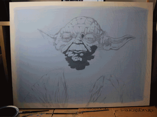
I'm extremely happy with the painting as it was a challenge working from a computer screen and a medium I rarely use. Hopefully, this giant portrait of the Jedi Master will make it very clear to visitors exactly what kind of apartment they're in. I suspect I might try a couple more of Star Wars portraits in this style.
Well, that's all for today and 2010! I hope to be posting some very interesting work in here next year.Happy holidays from Yoda and I and may the Force be with you!

--CKL--

Monday, December 6, 2010

Get Real Get Right

I've been using personal pieces as an opportunity to experiment with new techniques. So while I was at home in Michigan for Thanksgiving, without my usual ink or 21" computer monitor, I decided to challenge myself. After numerous listens while house painting, I settled on the idea of a piece about Sufjan Stevens and his new heavily-electronic album "The Age of Adz" (which is f*cking fantastic, by the way) I opted to do a straight portrait with neon facepaint, the trademark fake wings and a background of circuitry sort of emanating from his head.
After I had finished inking and brought the image into Photoshop to adjust the color of the lines, I was really unhappy with the background and the way it flattened the whole piece, no matter how many different ways I tried to solve it. So I promptly found some great reference photos of circuit boards to work from and began drawing a much more complex background of circuitry on some onionskin.
Upon adding the new circuitry background, which certainly took a while to draw, I was instantly happy with the effect it had. You can also see the face paint layer I had inked on onionskin.

In approaching the color, I wanted to use the colors I shy away from - very saturated pinks and greens. These seemed to make sense with the new neon-heavy image Sufjan has crafted to accompany the new sound. I was also glad that the background could afford to be pretty simple and solid green given the complexity of the circuitry lines over it.The layers of the image in Photoshop. It can be quite hard to keep track of!
Overall, I had a blast problem-solving this piece with tackling some new colors and some complicated drawing and inking.
--CKL--

Friday, November 19, 2010

Harry Potter!

So there's this small little film coming out today, not a whole lot of hype or anything, called Harry Potter & the Deathly Hallows.
I almost hate to admit it, but I'm really excited about this film, although I didn't go last night at midnight. Whoops. I remember sitting on my couch and devouring Deathly Hallows from start to finish the day it came out. And it's been really quite interesting to watch how both the films and the cast of the HP films have matured and consistently gotten better and better. It's really quite an achievement for a movie franchise.
Anyway, from the dark, melancholic look of the trailers and the rave reviews I've read thus far, its shaping up to be the best of the franchise, like The Empire Strikes Back of the HP films.
In order to celebrate this cinematic event, I decided to do an illustration about the film featuring a bloodied Harry in a dork forest using his wand to light the way while three Death-Eaters lurk in the background. I went through all of the trailers and clips from the film to get reference for Daniel Radcliffe, as he and the rest of the cast have definitely grown up. In looking up the Death-Eaters, I found a great picture of all of the masks, which are really quite ornate and beautiful.I also used Photobooth for some quick reference. Despite what I've been told and how easy it would be, I still haven't ever been Harry Potter for Halloween. Maybe I can pull off the Pagemaster.
Below is a gif of my process from pencils to the final illustration.

I had a lot of fun throughout the entirety of this piece in trying to convey the darker and grittier tone the HP films have taken on as they draw to a close. I'll definitely be doing a follow-up piece when the second film is released next summer!

--CKL--

Thursday, November 4, 2010

The Liars & the Fakes

Back! Apologies for the lack of posting recently, but I've been relatively swamped. I'll try to get some more posts coming in the upcoming weeks. For now, I wanted to stop in and do a quick blog about my newest Least of Creatures video for "The Liars & the Fakes"
I did a blog entry about "Arrow" back in June and ended up not doing one about the second video for "Compass" as that animation came together after a couple different versions.
"The Liars & the Fakes" is a song that I wrote and recorded in the summer of 2009 and was never terribly happy with in terms of the quality of the recording, lyrics and pace. So when I came across the song on my iTunes shuffle, I felt as though I could do it better now that I've (hopefully) gotten to be a better musician. Well, that and I always like a good stomp and clap song.
As I was starting to think about the video, I wanted to do something flat and graphic so I decided on a very simple color scheme that would repeat throughout the video.To make this video less like the one for "Arrow" I decided to design less with the text and settle on one bold font that would occupy just one side of the frame, but still appear in-tempo with the music, while an animated image would move on the other side of the frame. I managed this by creating images that are only the text and then images that are only frames of the animation because when it comes time to edit, I simply put one sequence of images on top of the other. This way, both the text and animation sequences have different paces within the same frame.
In the sections of the song without any vocals, I decided to put myself into the video as the "band" playing the song. And since the Least of Creatures is just me, its a silhouetted me playing guitar, bass and stomping and clapping along.
In having prepared the images to fit together in Final Cut, the editing only took about one day, with some occasional tweaks here and there.
I'm extremely happy with how the song and video came out. Its catchy and graphic and straight-to-the-point and feels like a real advancement in how I'm learning to animate. Since I put it up online, its quickly become the most viewed Least of Creatures video!
Enjoy!

The Liars and the Fakes from The Least of Creatures on Vimeo.

--CKL--

(P.S. These full size images make for some pretty cool wallpapers!)

Thursday, September 23, 2010

Gangsters and Zombies (not fighting unfortunately)

Just wanted to drop in with 2 banners I did this past month for Capital New York. I don't have a ton of sketches or process images to share for either since both had roughly 24 hour turnarounds.
First up is a piece about the new HBO series Boardwalk Empire starring Steve Buscemi and Michael Shannon, created by Sopranos writer Terence Winter and produced by Martin Scorsese. I really had a blast drawing Buscemi and Shannon, who are just plain creepy looking guys, and the clothing from the 1920s.
Next up: ZOMBIES! I was presented with the idea of New York gubernatorial candidate Carl Paladino and his Tea Party backers attacking as zombies now that Paladino is closing in on Andrew Cuomo in the race. I think it goes without saying that this was fun. Everyone likes zombies. One of the best parts of working on this piece was looking at Tea Party signs at teabagfail.com to get ideas for the signs Paladino's followers are holding.

-CKL-

Sunday, September 12, 2010

Dragons?

Fantasy or science fiction illustration isn't really my kind of thing despite being a tremendous Star Wars (although Star Wars is in its own realm) So when the band A Boy Named Susan contacted me to do the album art for their single "Either Way You Are", I was unsure about tackling the concept they had imagined which was two kids in medieval armor facing a dragon (see sketch below)After thinking about the idea for a bit, I thought it would be a challenge and definitely something different in my portfolio. So I did 2 quick sketches since the idea was pretty concrete at that point, but heightened the cinematic and dramatic of the situation with an over the shoulder shot and scaled down the boys to really play up the difference in size.
When we agreed the first composition was better, I compiled a lot of reference images for the dragon, because I was really going to need it. One of the first things that popped into my head was the dinosaurs Bill Watterson drew in Calvin & Hobbes.
It goes without saying that Calvin & Hobbes is one of the greatest comic strips of all time and that Watterson is a wonderful artist. He always found innovative ways to change up the dull format of a strip and really went all-out on the Sunday strips with these elaborate drawings of alien worlds, spaceships, nature, and of course, dinosaurs.
I also looked at several Frank Frazetta paintings, the dinosaurs from Jurassic Park, as well as skulls of Utahraptors and Velociraptors .
I took to Photobooth to figure out the poses for the boys. Obviously a ruler is a proper substitute for a broadsword.
When it came time to color, I wanted to try something different, as this was turning into one big experimental piece. So i whipped up a couple of quick color comps and tried to find something that would set the boys apart from their surroundings and imply just how out of place they are. I started coloring the piece with the first color scheme of purples and greens, but as I got further along, I just wasn't enjoying it nor did it seem to fit the image. I went back to the third color scheme of blues and reds, but tweaked it.
Here is the linework only with some colors adjusted and the red and blue highlights I added for some dramatic lighting and to make the dragon stand out from the background.
Here are the colors with the stone-like texture I placed over the image. I am especially happy with way colors sort of undulate through the smoke up to a neon green at the top of the image.
The very last thing I added was the tiny glare off of the sword in the middle of the composition, which I felt was necessary to brighten up that space and make the pose even more heroic. All in all, I'm tremendously happy with the way this turned out. I'm always glad when an illustration can have me engaged from the very beginning from gathering the reference to the mechanics of the drawing to the experimentation with colors.I will be posting a link to download the song very soon so please keep a look out for that. It's a great song from a ridiculously talented group. I can promise that it will be stuck in your head for days.

--CKL--

Sunday, August 29, 2010

(M)ad Man

I feel like I'm touting AMC's original shows a bit much now that I've done a Breaking Bad piece as well as this new Mad Men piece. Still, the fact is that they are two of the most well-crafted shows on television. In fact, both won at the Emmys last night, with Bryan Cranston and Aaron Paul winning for their performances on Breaking Bad and Mad Men winning Writing and Dramatic Series.
With season 4 of Mad Men in full swing, I felt like taking a stab at a portrait of the man himself, Don Draper. Throughout the series, Draper has always been steadfast and confident, an enigma at his workplace. However, season 4 has shown the slight cracks in his facade as his family dissolves and his lifestyle catches up to him, something which was especially evident in last night's episode Waldorf Stories.
I wanted to show this version of Draper, alone and at the office after hours because there's no real home to go back to.It turns out Jon Hamm is really tough to draw. It seemed to be about lining up the features just right between the ridiculously good hair and the uber-masculine jawline.
After some struggling, I got what felt like the right fit. In wanting to show the weaker side of Draper, I also decided to show the stubble grown out a bit, his tie loosened, and wrinkles in his shirt. I feel like its really like letting his guard down now that's alone.When it came time to color, I fooled around with different color schemes for a while before settling on a palette that was softer and reminiscent of the 60s. Like my previous Predators piece, I decided to try out a very strong key light on one side of the face. When I was starting this, I took reference photos of myself and also looked at pictures from Scorsese's Shutter Island, because of its super dramatic lighting.I also began experimenting with more gradients and blurs, which is normally something I shy away from in fear that its over-Photoshopped. But I'm very pleased with the way they worked and how the gradients create a sort of film noir slice of light across Draper's face.Overall, this piece ended up being a real success for me in terms of experimentation and trying to capture a likeness.
Now for something completely different, I am working on an image for an album cover with knights and a dragon!

--CKL--

Sunday, August 15, 2010

The Guns of August

I've recently begun doing banners for the Capital New York, an online publication which is still in its beta phase. Capital New York was co-founded by former New York Observer editor Tom McGeveran.
What's great about Capital New York, apart from just really solid writing, is Tom's goal to include illustration as an integral part of the site, which includes a new banner every week. Other artists to create banners have been Steve Broder (one of my illustration idols) and Alex Citrin. My first banner was a portrait of M.I.A. during her controversial performance at Governor's Island, where sound problems caused her to throw her mic at the sound crew and spit at cameras before a huge downpour started.
This time around, Tom wanted to cover the theme of "the Guns of August" meaning all of the big, flip outs that have happened lately, which includes JetBlue flight attendant Steven Slater, David Dinkins flipping the bird, and K Rod assaulting his father-in-law as well as the giant police shoot out in Harlem.
Part of the challenge with these banners is creating an image within such a specific format (708x145 pixels) as well as designing the image to fit nicely with the layout of the Capital New York site. With the sketches, I tried to include all of the subjects in the same melee, as though this were some kind of conspiracy of ridiculous behavior. I also really wanted to include the text "The Guns of August" because it just seems so ominous and cinematic.Both Tom and I really liked the first sketch. I was jumping at the opportunity to do such dramatic poses as well as the detail of the Harlem buildings in the background. Although we opted to change the poses of the three central characters as to not imply that they were all fighting each other.After we agreed on this composition, I went ahead with the drawing. Because of the size of the banner I did nearly the entire drawing with a Micron pen rather than my usual brush to preserve as much detail as possible.From the beginning of the drawing, I already had a color palette in mind. In looking up reference photos of K Rod, I really enjoyed the colors of the Mets jerseys (maybe because of the similarity to that of the Detroit Tigers) and I figured that they could extend to the entire image, including Slater's JetBlue uniform.I'm very happy with the piece and how well the colors ended up working. I'm especially happy with how nicely it fits into the top of the Capital New York site.I always have a blast working with Tom and Capital New York and certainly look forward to the opportunity again!
Stay tuned as I'm working on a couple of new pieces that I'm very excited to show.

--CKL--