I almost hate to admit it, but I'm really excited about this film, although I didn't go last night at midnight. Whoops. I remember sitting on my couch and devouring Deathly Hallows from start to finish the day it came out. And it's been really quite interesting to watch how both the films and the cast of the HP films have matured and consistently gotten better and better. It's really quite an achievement for a movie franchise.
Anyway, from the dark, melancholic look of the trailers and the rave reviews I've read thus far, its shaping up to be the best of the franchise, like The Empire Strikes Back of the HP films.
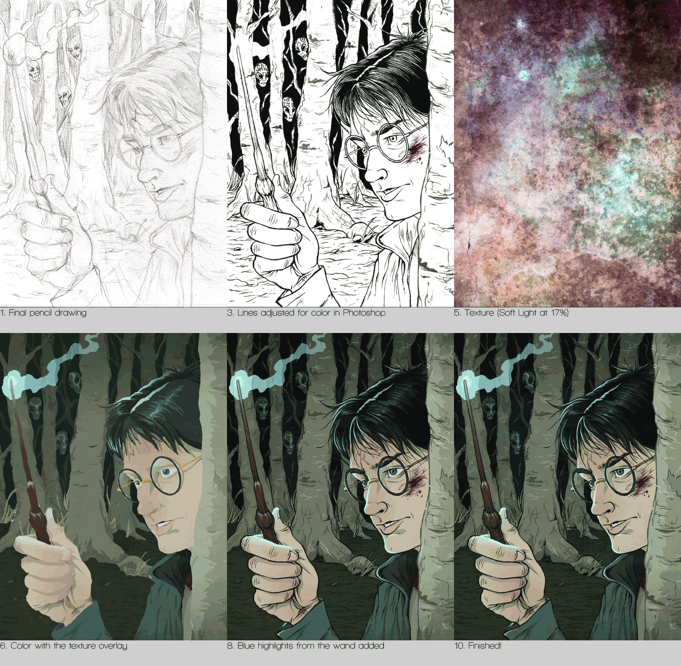
In order to celebrate this cinematic event, I decided to do an illustration about the film featuring a bloodied Harry in a dork forest using his wand to light the way while three Death-Eaters lurk in the background. I went through all of the trailers and clips from the film to get reference for Daniel Radcliffe, as he and the rest of the cast have definitely grown up. In looking up the Death-Eaters, I found a great picture of all of the masks, which are really quite ornate and beautiful.
 I also used Photobooth for some quick reference. Despite what I've been told and how easy it would be, I still haven't ever been Harry Potter for Halloween. Maybe I can pull off the Pagemaster.
 Below is a gif of my process from pencils to the final illustration.
I had a lot of fun throughout the entirety of this piece in trying to convey the darker and grittier tone the HP films have taken on as they draw to a close.


 I'll definitely be doing a follow-up piece when the second film is released next summer!
--CKL--


Hey Cameron! I'm just a fan and all, (I was in in Giancarlo's high school, too. [Loose association]), but I think you spelled "dark" wrong. It's "dork" in the paragraph you describe the illustration in.
ReplyDeleteGreat work, by the way.
Is that the secret to making digital work look traditional texture? The image of the death eaters masks you found is really nice all the mouth openings are crazy I'm def. going to need to draw those.
ReplyDeleteS.B. - Those masks blew me away. Much better than the half-skull ones worn in Goblet of Fire. As for the texture, I rarely use textures, let alone one as complex as the one on this piece.
ReplyDeleteWhen I do use texture, its mostly used to give a little more life to the flat colors that I like using.
I think textures can very much overtake and potentially ruin an image if they're not used in a simple and subtle way.
Hi Cameron, I just found your blog while doing some research for a mask project, I'm planning on creating a mask for a death eater. I reckon your blog is pertty cool and you have some very cool drawings.
ReplyDeleteGood job!
Harry Potter is my favorite story. When I get a time, I read the book. Thanks for share the post about Harry Potter.
ReplyDeletezoella harry potter