This piece may look a bit familiar - I posted a couple of small screengrabs from it a while back and briefly considered making it my business card until I opted to use something from my Crash Landing series instead. Anyway, I thought I'd share the process behind this piece. Also, I just really like making gifs of each step.
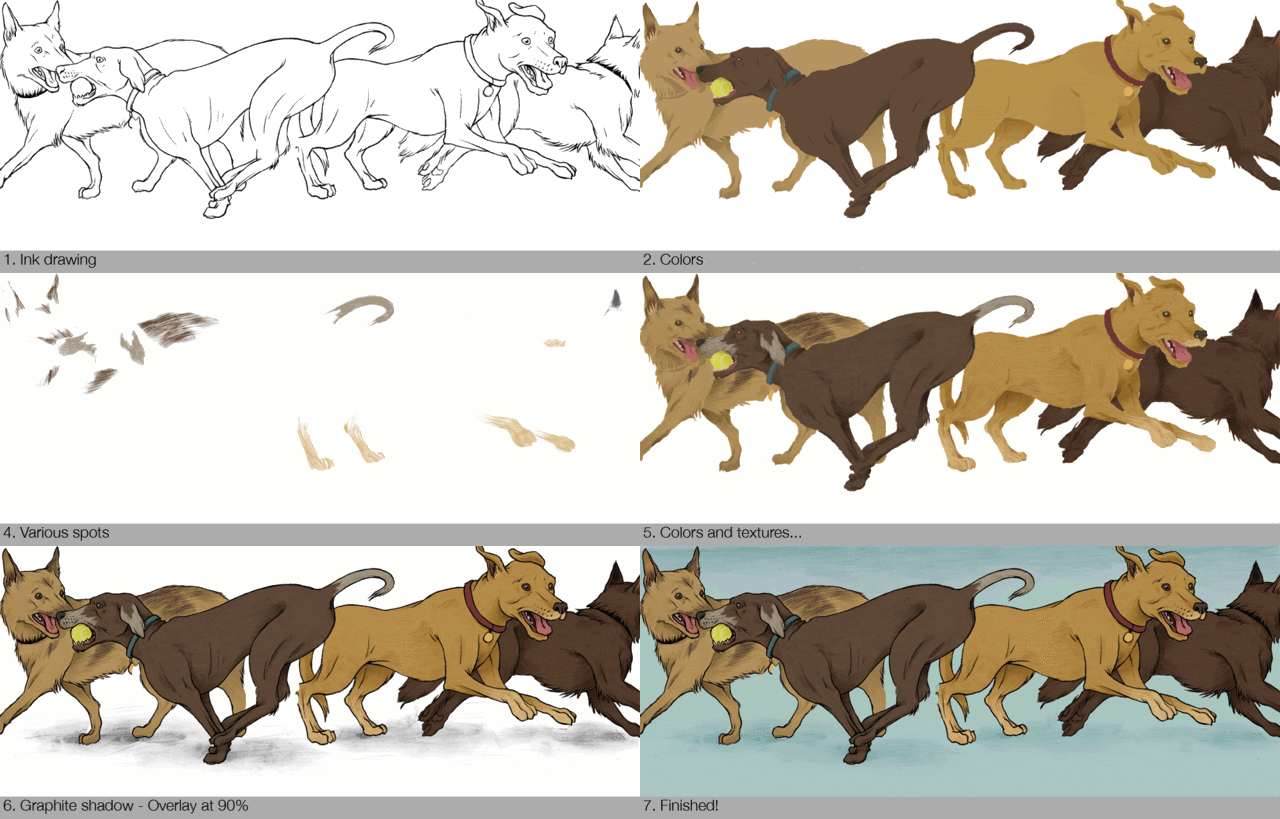
Let's begin with the background. I did the drawings for in several layers so that it was easier to manipulate and move around. There were separate graphite drawings for the texture of the fur and the spots as well as the shadows underneath the dogs.I wanted the dogs in the background to be the stereotypically large and athletic breeds to play up the piece's whole mentality of the fat kid on the sidelines. I had fun drawing them and fooling around with the textures and colors.

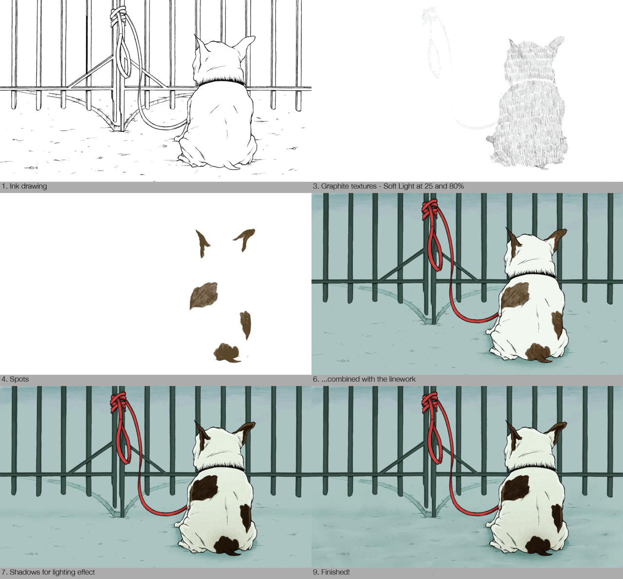
But that's only half of the drawing...on to the fat French Bulldog in the foreground! I really enjoyed working on this little guy and exaggerating his pudginess, imagining how the kind of owner who ties his dog up outside the dog park would let him get to this point.
Again, there were separate layers for the fur texture and spots. I also tried something new by shading a piece of tracing paper and then going in with the eraser to create more distinct highlights and shadows for the ground.
 And then BAM! Combine the background and foreground. I'm very pleased with how it came out and how it really allowed me to try out some new and different techniques.


 You know what's funny is that I'm totally a cat person (meet Gandalf)

Again, there were separate layers for the fur texture and spots. I also tried something new by shading a piece of tracing paper and then going in with the eraser to create more distinct highlights and shadows for the ground.
 And then BAM! Combine the background and foreground. I'm very pleased with how it came out and how it really allowed me to try out some new and different techniques.

 You know what's funny is that I'm totally a cat person (meet Gandalf)
--CKL--


sweet! i like your giff yo ;)
ReplyDeleteGreat work! I'm really interested in your process!
ReplyDelete